Icon theme

Previous Topic Next Topic
 
classic Classic list List threaded Threaded
14 messages Options
Reply | Threaded
Open this post in threaded view
|

Icon theme

to-b
This post was updated on .
Hi there,
a little while ago i started to do some alternative icons for LibreCAD. I stopped before i had all functions covered but i inserted them into the mockup i did back then https://github.com/LibreCAD/LibreCAD/issues/320.
The aim was to have simplistic icons that work well for dark and light window themes.


A few days ago i read about the Art Libre icon theme in the works by Barbara Muraus (http://gnome-stereotype.tumblr.com/post/26134120044/next-stop-art-libre).
The style has some similarities to the icons i did (among others she also restricts herself to only two shades of gray).
Because of this i thought it might make more sens to start all over again with a new theme based on Art Libre. As inkscape and gimp might use these symbols in the future it would surely be nice when using the programs at the same time. In general i think it is important that the libre graphic programs should work together nicely. It would probably be good to make the drawing tools look similar to the "cage" tool from the Art Libre theme (line 3 at column 3).


cheers,
to-b
Reply | Threaded
Open this post in threaded view
|

Re: Icon theme

sp1der
to-b

These are all very interesting ideas you have here - for me personally I prefer your original line of thought here:
https://github.com/LibreCAD/LibreCAD/issues/320.

Personally I think it would be better for libreCAD to stay slightly more 'individual' and unique!

What do others think?
Reply | Threaded
Open this post in threaded view
|

Re: Icon theme

R. van Twisk
Administrator
ct,

I have been giving this a lot of thoughts myself, and I do actually like the double line of icons like we have in LibreCAD myself.

The proposal in the PDF looks quite nice though and something we must not forget, but there is a lot of things going on, even after you start a action the circles and everything
else stays on the screen, this might be confusing and additionally, how do you respond to the icons when a user clicks on them, or just gray out?

Additional, something we must not forget is that LibreCAD is used on many computers with limited capabilities, low screen resolutions and low CPU power.
Also for that reason I would like to have the screen as simple as possible.

I know that some popular programs to show off all there icons and that a large set of users likes that and I also am wondering if we
can support them both somehow.

food for thoughts still….


On Jul 4, 2012, at 3:24 PM, ct [via LibreCAD] wrote:

to-b

These are all very interesting ideas you have here - for me personally I prefer your original line of thought here:
https://github.com/LibreCAD/LibreCAD/issues/320.

Personally I think it would be better for libreCAD to stay slightly more 'individual' and unique!

What do others think


If you reply to this email, your message will be added to the discussion below:
http://forum.librecad.org/Icon-theme-tp5706838p5706845.html
To start a new topic under LibreCAD, email [hidden email]
To unsubscribe from LibreCAD, click here.
NAML

Reply | Threaded
Open this post in threaded view
|

Re: Icon theme

sp1der
Ries

I suppose for me its a personal thing - but of course your right, we need to look at this in a broader sense and  - yes if somehow the icons and working method could be simplified but still keeping the 'LibreCAD' theme, this would be the answer here.

Reply | Threaded
Open this post in threaded view
|

Re: Icon theme

R. van Twisk
Administrator
For LibreCAD 3 we will definitely look into having the UI better de-coupled from the working code, possibly using QML, I think for LibreCAD 2.0.x this is going to be very hard, or just a lot of work.
The LibreCAD theme (colors, icon look/feel) will stay for sure and a lot of way's of working will stay the same of course.

Ries

On Jul 4, 2012, at 4:02 PM, ct [via LibreCAD] wrote:

Ries

I suppose for me its a personal thing - but of course your right, we need to look at this in a broader sense and  - yes if somehow the icons and working method could be simplified but still keeping the 'LibreCAD' theme, this would be the answer here.


If you reply to this email, your message will be added to the discussion below:
http://forum.librecad.org/Icon-theme-tp5706838p5706847.html
To start a new topic under LibreCAD, email [hidden email]
To unsubscribe from LibreCAD, click here.
NAML

Reply | Threaded
Open this post in threaded view
|

Re: Icon theme

BigAl
Hi to-b,

You have my vote. A a very new user the layout you are suggesting seems great to me. It would be a big improvement. Yes, I know that there are tool tips but it seems to me that the current (1.0.2) layout is confusing.

Cheers

Alan
Reply | Threaded
Open this post in threaded view
|

Re: Icon theme

to-b
Hi R. van Twisk,
sorry for the long time it took me to answer.
R. van Twisk wrote
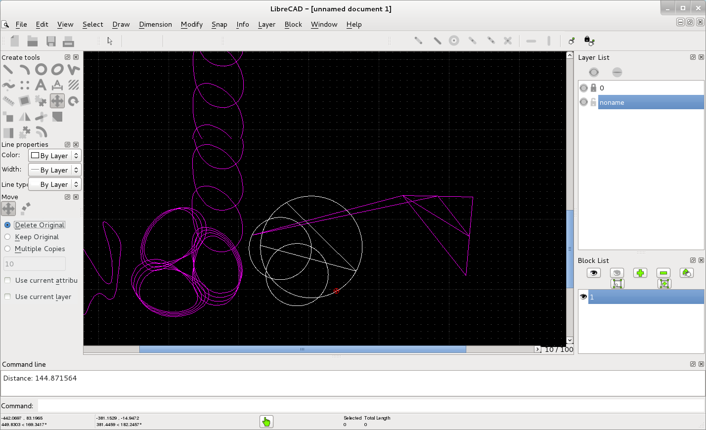
... even after you start a action the circles and everything
else stays on the screen, this might be confusing and additionally, how do you respond to the icons when a user clicks on them, or just gray out?
I wouldn't gray out or hide the symbols. I think they should just stay on the screen and be accessible. If the user clicks on an icon to activate a new action, the old action should be ended immediately.
E.g. think of the situation that an user starts drawing a circle but then realizes that what he really needs is an arc. He would just click on the arc symbol and start drawing the arc without having to manually stop the circle drawing process first.
R. van Twisk wrote
Additional, something we must not forget is that LibreCAD is used on many computers with limited capabilities, low screen resolutions and low CPU power.
Also for that reason I would like to have the screen as simple as possible.
Of course it is very important to have a simple screen and also not to waste screen space. And not only small screen resolutions are benefiting from this.
But i think hiding most of the options and therefore jumping back and forward between different toolboxes all the time can be confusing and complicated to understand/use.
R. van Twisk wrote
I also am wondering if we can support them both somehow.
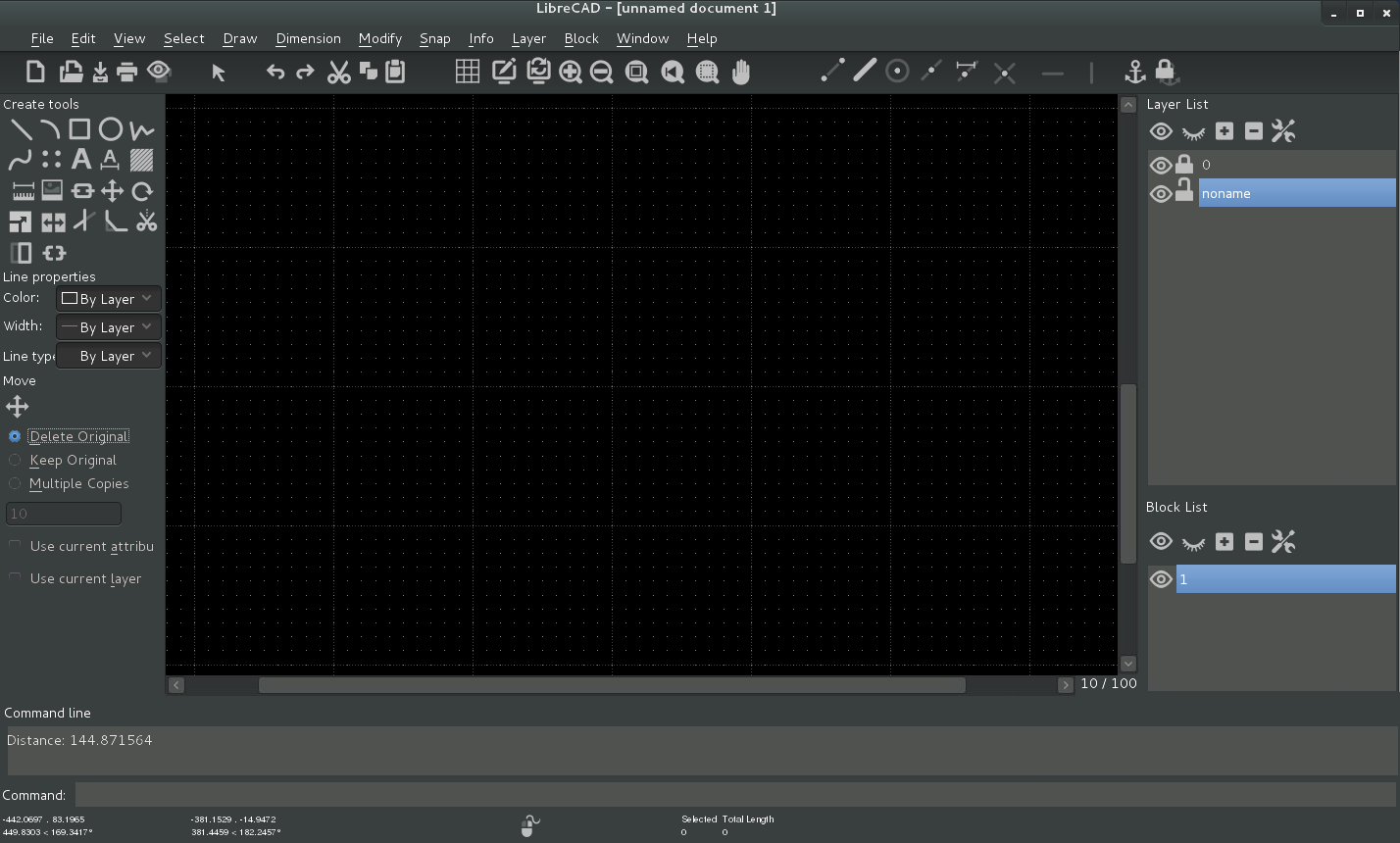
An option to have a layout that is close to the current one and leaves a little bit more space for the canvas for really low resolution screens could be to display the "tool properties" window from the PDF and the main "toolbox" from the PDF in the same dockable window. It could change when a tool is selected and have the back arrow like in LibreCad2.0. This could be an option in the properties that people with very low screen resolutions could activate. While users with higher (normal) resolution displays could have them displayed both at the same time.
BigAl wrote
Hi to-b,

You have my vote.
Hi BigAl,
thanks for your support, but at the end of the day it's the decision of the developers and they should be doing what they feel most confident with. I'm only trying to help them with some ideas for the great work they are doing.
cheers,
to-b
Reply | Threaded
Open this post in threaded view
|

Re: Icon theme

to-b
About the actual topic of this thread. Maybe it is was best if i just suggested some improvements for some of the icons of the current theme created by pablo ramirez alem.

Icons that fit with the coming (Art Libre) Icons of GIMP and Inkscape and the Symbolic Icons in general (https://live.gnome.org/GnomeOS/UX/Guidelines/SymbolicIcons) could be an option only for gnome3 users who like to have some more consistency between the different creative programs.
Reply | Threaded
Open this post in threaded view
|

Re: Icon theme

to-b
Symbolic Icons with Dark Theme

This is a test with the symbolic icons for gnome3 users. I tried to use as many of the icons made by Jakub Steiner and Barbara Muraus as possible. When i couldn't find a fitting icon i created it myself partially out of existing icons/ elements.

I chose to insert the icons in a mockup with the dark standard gnome3 theme (Adwaita dark) because i think it makes sense to have a CAD application use the dark theme.

In order to see the full Image you have to right click the image and choose "view Image".
Reply | Threaded
Open this post in threaded view
|

Re: Icon theme

claus82
In reply to this post by to-b
Hi all, this is something I could do with a good program like Inkscape... so I could cooperate, but I think that at this moment we should first focus on the Librecad functions, for example, in my case I need ttf and otf fonts support, but there are other users that need functions for drawing scale, curves, and so on...
So first I think we need to have more functions and improve the ones we alredy have, then we can (co)operate about LC look!
Just my opinion anyway!!

See ya!!!
...the problem is not the problem, the problem is your aptitude about the problem...
JCW
Reply | Threaded
Open this post in threaded view
|

Re: Icon theme

JCW
In reply to this post by to-b
Is this already an icon set or just a modfied screenshot of the gui?
JCW
Reply | Threaded
Open this post in threaded view
|

Re: Icon theme

JCW
In my opinion a good looking GUI is very fundamental for a programm like this.
I'n study product design, so I have learned that the look and usability is of particular importance for the popularity of a product (or programm).
I also know others who use Librecad and are confused by the icons. It is very inconvenient to leran this programm and understand how it works.
Many icons now are way too detailed and not easy and fast to distinguish. (e.g. Insert Image, Draw Splines, Modify ...) So while working always takeing a close look at the icons or waiting for the tooltips is quite annoying.
Maybe most of you got used to the GUI and have memorized the location of the buttons so these problems may not seem that important for you.

But I think if this programm would have more user acceptance it would get more attention and support.

So I would be very much interested on a new iconset. I would also contribute Icons if necessary.
Reply | Threaded
Open this post in threaded view
|

Re: Icon theme

dxli

We definitely need help here. We have been talking about icon themes for long, but no manpower available to get it done.

I remember we would like to have svg icons, instead of rasterized ones.

Thanks,

dxli

JCW wrote
In my opinion a good looking GUI is very fundamental for a programm like this.
I'n study product design, so I have learned that the look and usability is of particular importance for the popularity of a product (or programm).
I also know others who use Librecad and are confused by the icons. It is very inconvenient to leran this programm and understand how it works.
Many icons now are way too detailed and not easy and fast to distinguish. (e.g. Insert Image, Draw Splines, Modify ...) So while working always takeing a close look at the icons or waiting for the tooltips is quite annoying.
Maybe most of you got used to the GUI and have memorized the location of the buttons so these problems may not seem that important for you.

But I think if this programm would have more user acceptance it would get more attention and support.

So I would be very much interested on a new iconset. I would also contribute Icons if necessary.
JCW
Reply | Threaded
Open this post in threaded view
|

Re: Icon theme

JCW
So what about the theme of to-b? I like the simplicity of the icons.

Unfortunately I could not find a full pack of the Art Libre Icons.
Other inspirations for very good icons you can find in the noun project (http://thenounproject.com/)

I am quite familiar with inkscape, so making scalabel SVG icons shouldn't be a problem.

First we should have an overview of all the icons wee need.