Another Font Conversion Experiment

Another Font Conversion Experiment

|
Re: Another Font Conversion Experiment
|
|

Re: Another Font Conversion Experiment
|
|
Re: Another Font Conversion Experiment
|
|
Re: Another Font Conversion Experiment
|
|
Re: Another Font Conversion Experiment
|
|
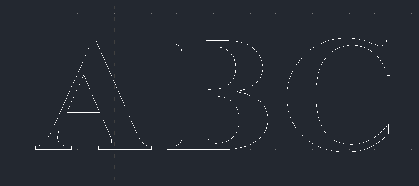
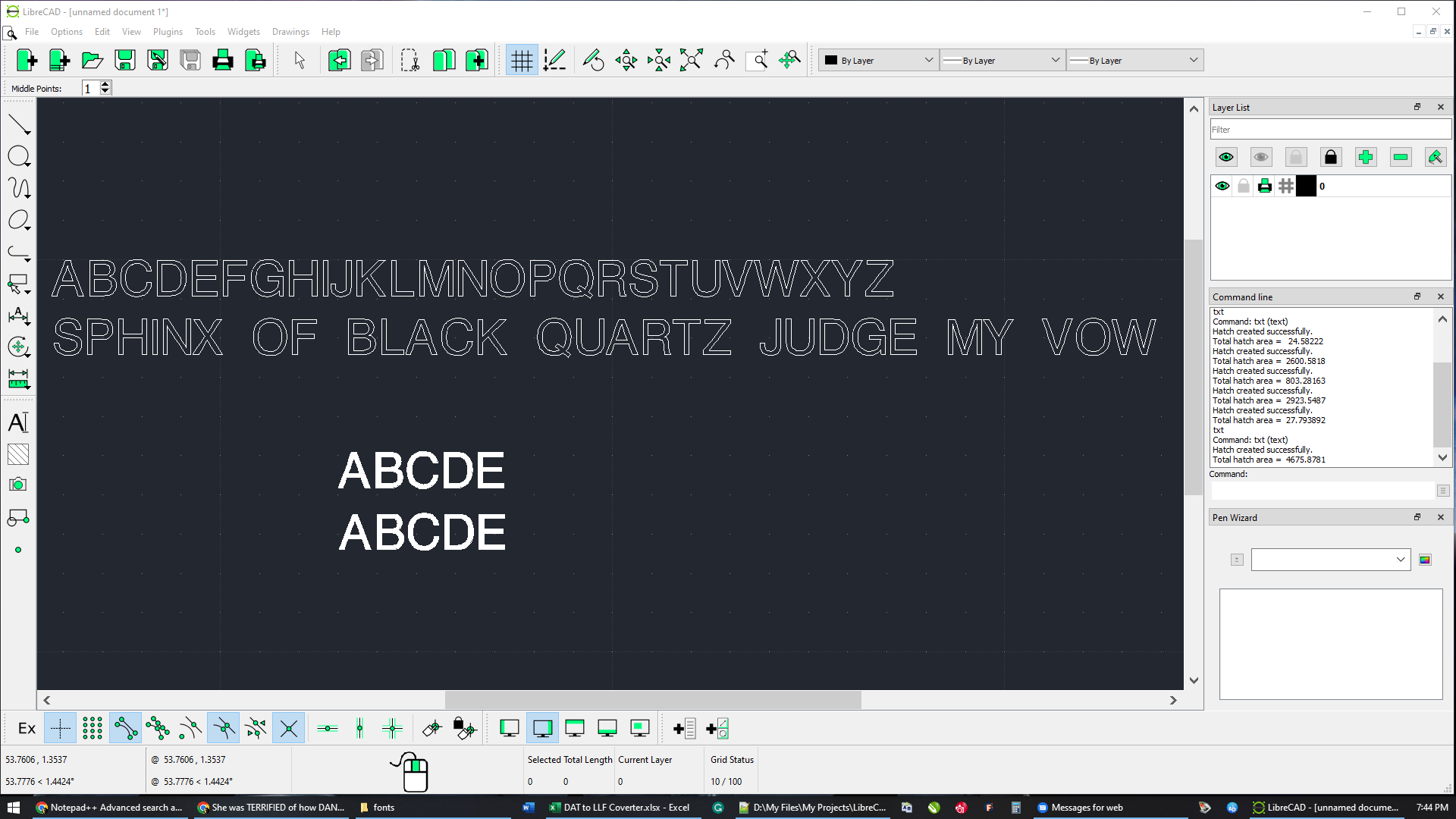
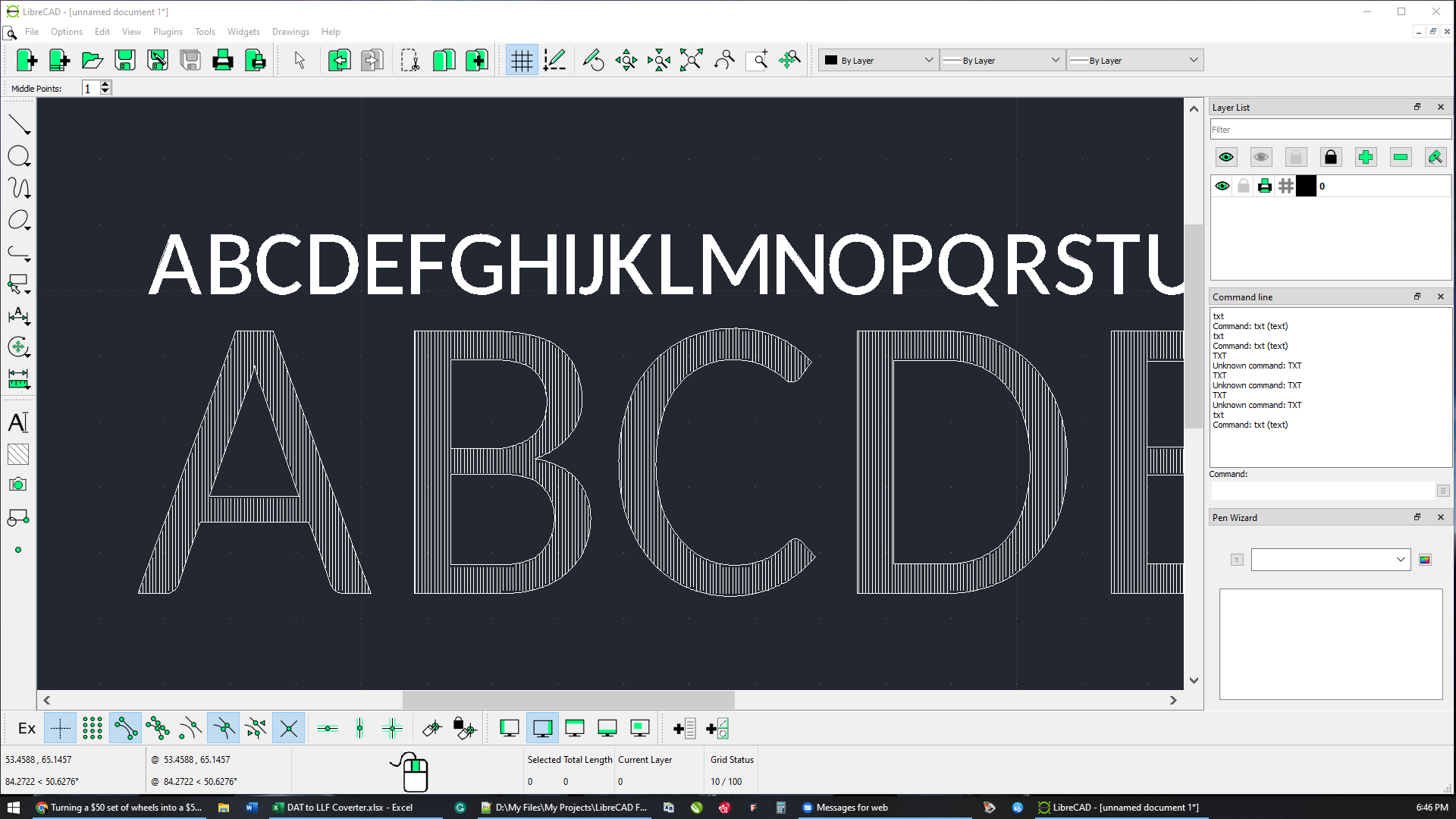
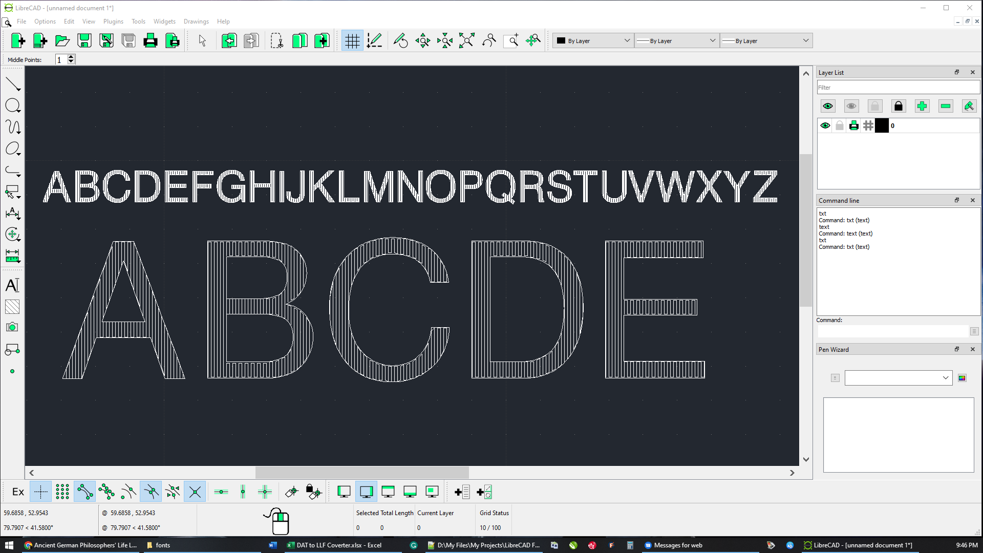 to make the manual conversion easier. These were usually done with a Level 4 unconnected fill. But as I said when a wide enough pen is applied, they print solid and mimic a Truetype fonts.
Re: Another Font Conversion Experiment
|
|
Re: Another Font Conversion Experiment
|
|
Re: Another Font Conversion Experiment
|
|
Re: Another Font Conversion Experiment
|
|
Re: Another Font Conversion Experiment
|
|
| Free forum by Nabble | Edit this page |