GUI update
|
This post was updated on .
These changes are only available in the Nightly builds from the master branch.
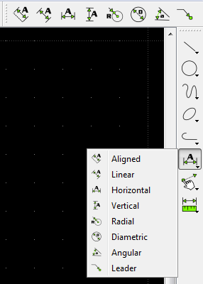
There is more work to be done but this update has several advantages: - avoids going in and out of categories constantly - users can decide what tools are exposed and where - allows for user defined custom icon sizes - easier for developers to understand / modify The old CAD toolbar was a remnant of QCad, and it was limiting development. There is a lot of redundancy with all the new toolbars and dockwidgets; but the idea is to let people try and see what works for them, and to allow for an understanding of the basic Qt widgets. http://doc.qt.io/qt-5/mainwindow.html Tell us what you will use and if you have ideas for improvement. Clearing old settingsSome of your old settings might be in conflict with the new user interface. There is a new option to clear the layout settings: Options -> Application Preferences and under the "Defaults" tab press the "Layout" button and then restart LibreCAD. This will allow you to see the new default layout of the GUI. It's a work in progress... so submit screen shots of your custom layout: http://forum.librecad.org/requesting-screenshots-td5712432.html Custom Toolbars and Menushttps://github.com/LibreCAD/LibreCAD/wiki/Widgets The new sidebarThe sidebar is made of dockwidgets. Checkout the following video to understand how they can be arranged. https://youtu.be/-wnRZCFr2ds I might add an option for the number of columns.  ToolbarsIf the sidebar dockwidgets take up too much space for you, then you can use the "Categories" toolbar instead. There is also individual toolbars for each category.  Custom icon sizeYou can now select a custom icon size in application preferences. The toolbar icons will update after you press "Ok"; however, you will need to restart LibreCAD for the sidebar icons to update. |
|
This post was updated on .
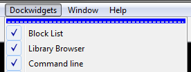
drawing area context menuRight-click produces a context menu in the default selection mode. Tools you use will be automatically added to the context menu, with the most recent action at the top. However, commands currently won't add a tool to this menu. https://github.com/LibreCAD/LibreCAD/issues/583 tear off menusThe menus on the menubar can become windows by clicking the dotted line at the top of the menu.  This is useful for the toolbars / dockwidgets menus, because it allows you to check / uncheck more than one without having to reopen the menu. other updates- options → application preferences → anti-aliasing - view → fullscreen - toolbars → order - dockwidgets → select - updated toolbar context menu |
snap indicatorThere is now an alternative to the Crosshair, which is called Spiderweb (for lack of a different name). This is useful if you work with orthogonal lines a lot and don't want the crosshair hiding the preview. https://youtu.be/0v9TS7IyvKM You can also change the color of the snap indicator now. This is useful if you use a white background (or if you just want a different color). window activationWhen a sub-window (drawing) is closed the last active sub-window will be re-activated. tabsTabs are now movable by dragging and dropping. There is a new option in Application preferences → Defaults to start in tab mode. modify tools and selectionYou can once again activate a modify tool then select some objects, then press Enter, and then continue. Something new is that you can use XButton1 instead of Enter. entering commandsXButton1 will also act like Enter for the command line. xbutton1Xbutton1 is a side button on a PC mouse (usually for going back in a web browser).I don't know if mice for Mac have what is considered an Xbutton1. There are other options new in Qt5 we can try (Qt::BackButton). The use of this button is experimental and might change. option to remove scrollbarsYou can now remove the scrollbars in Application Preferences.Removing them significantly improves panning performance. :-] More investigation could lead to improved performance with scrollbars. selectionThere is now a select toolbar, and category in the category toolbar.--- Post any questions or comments in: Nightly Builds / Master Branch |
DeselectionHolding the Shift key will make the default selection rectangle deselect. Dock Areas ToolbarThe "Dock Areas" toolbar allows you to show/hide all dock widgets in the left, right, top, bottom and floating dock areas. Command lineThe left and right dock areas are now dominant, which means that if you dock the command line at the top or bottom it will only expand between the left and right dock areas, instead of modifying them. The command line's title bar will automatically switch orientation depending on the dock area it is moved to, which helps save space. Styles and Style SheetsYou can now dramatically change the way LibreCAD looks! https://github.com/LibreCAD/LibreCAD/wiki/Style-Sheets |
«
Return to Archive
|
1 view|%1 views
| Free forum by Nabble | Edit this page |

