LibreCAD ver 2.2 User Manual Style
|
This post was updated on .
The LibreCAD ver 2.2 User Manual Style looks terrific but the functionality could be improved with a few style tweaks. I like to split the 1920x1080 Win10 screen with the application on the left half and the documentation on the right.
I prefer: * context menu icon to access chapters * contents heading on the right side of window to reduce distraction reading from left to right * only display chapter contents headings * hide contents headings when window is reduced below 50% of screen (currently set to about 50% of window) eg: example ------------ Edit:  Window: 40% Contents pane, 15% Margin, 45% Content 
|
Re: LibreCAD ver 2.2 User Manual Style
|
Administrator
|
Hi flywire,
first let me thank you for your contributions and efforts you put into LibreCAD recently. I recommend to contact Gary S and Fabrice via Zulip Documentation and Wiki stream. Start with @ for user name auto complete, then they are also informed by mail, that they were mentioned in a Zulip message. You may need patience too, but chances for replies are better. They can also answer your question about local environment to work on docs. Personal preferences are fine, but it is recommend to talk to other contributors first, to get a second opinion. This helps to avoid wasting time on contributions which probably can't be accepted later. As you can see in menu deviations between 2.0 and 2.1/2.2, this was not always the case in past. That change mixed up a lot and we want to avoid this in future. Armin
investing less than half an hour into Search function can save hours or days of waiting for a solution
|
|
In reply to this post by flywire
Here is the problem with personal preferences - In the last week the latest version of LibreCAD for Windows was downloaded from SourceForge ~10,500 times. Extrapolate that to the day it was released, Sept 2016, that would be 1.7 million times. Add to that Linux and Mac users and those that compiled LibreCAD themselves. Say that just 10% of them are active users - that is still roughly 200,000 users. I'm not sure that is even close to being right, but anyway you look at it there is a big number of potential users. Each one of them will have their specific environment, their own way of doing things and their own preferences. It is not reasonable to change the layout to suit any ones individual's expressed preferences. Using the numbers above, again if 10% of the 200,000 users use the RtD documents, that is still 19,999 of the 20,000 that are satisfied with the layout.
That is not to say changes cannot be made, but one person saying it needs done to be to suit their specific needs is a non-starter (IMO). If there was a suggestion for a change that was justified and that would suit the greater population of users then let the discussion / debate begin  . .
|
|
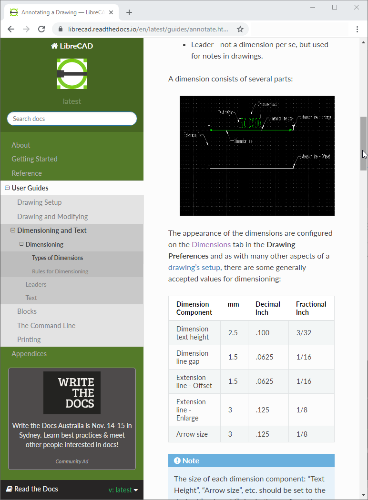
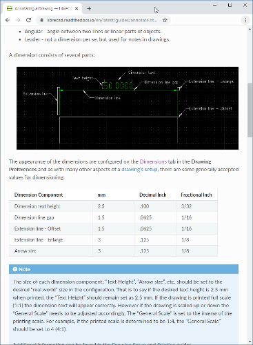
Thank you for the discussion but it would be more productive if it was focused on the justification (functionality and good design) rather than the measure used (personal preference). Design issues are addressed elsewhere within the application environment, for example Types of Dimensions "... as with many other aspects of a drawing’s setup, there are some generally accepted values for dimensioning:" having used the default settings these work better (in my opinion). This forum is another example where the lack of white space on the left of the window which makes it hard to read. The importance of white space to help human perception is normally a fairly early topic in technical design.
btw Two observations: * Politicians clearly demonstrate discussion/debate can overwhelm good judgment and facts * Lesson reinforced - communication will be appreciated more in the second person |
«
Return to LibreCAD-doc
|
1 view|%1 views
| Free forum by Nabble | Edit this page |

