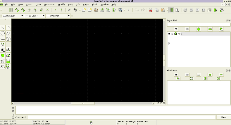
Need an icon for "Help Layer" in the layer widget.
12


12
Re: Need an icon for "Help Layer" in the layer widget.
|
OK. It's your choice. Let it be so.
The advantage of SVG I know. Therefore I it put. The size of the PNG files I made as real display, to avoid unnecessary scaling in this case. I see that LibreCAD is used, the scaling of the image 150x150. But why it is there, where only one fixed size? The scaling of the large size works well for 32x32 icons and more. But for small icons this is a bad way, this way you can get blur a blot instead of the image. To avoid this requires the alignment of the image on the pixel grid. Qt Framework is not capable of it properly. No matter what large image scaling is done and the thickness of the line too. Moreover, in this table, the Qt Framework is bad. The image is scaled to the width of the column, ignoring the margins. As a result, we have cropped the image on the right. It is now for the printer icons. Eye icon cropped on the right too. In addition, now the icons are different sizes in the same string. It's not neat looks. If there is a need to get icons for other sizes, it is better to use sets with different fixed sizes (this is not difficult if you have the source SVG) and add the appropriate settings. It is very desirable to make in the future, because the current icons are very small on high-resolution displays. What Qt can do as inactive, I also known. But I used different images for active and inactive. So not used it. So it turns more balanced visible icon sizes. This is my opinion only. You are not obliged to follow it.
|
Re: Need an icon for "Help Layer" in the layer widget.
|
Administrator
|
stranger573,
there is nothing wrong with your opinion, I mostly agree with your point of view, if I would start a new project. But for the current task, my focus was on construction layer feature. For this I enhanced the GUI part as it is already done in the code base. Concerning the cropped images, it's a matter of wrong column width. I'll adjust this. As I already wrote, there is enough scope to improve the way of dealing with GUI icons. Doing this in an existing code base is not a simple task. One has to consider the multi platform capability with lot of different look and feels and there are still different approaches in the existing code base. It's up to somebody to take this challenge, but not for a coming 2.0.x release I think. There is too much space to break the stability we have reached. Maybe for a 2.1 release, but it should be a must for LibreCAD 3 to have multiple icon themes to match different desktops. With your icons for file import/export I started to build a SVG file for each single icon. This makes exporting the PNG files much easier. I've added copyright and license information in document meta data to do justice for contributors. I'd like to add a SVG template and instructions to wiki or code base as a starting point for future contributors. Armin
investing less than half an hour into Search function can save hours or days of waiting for a solution
|
|
In reply to this post by LordOfBikes
Your new construction layer in layerwidget works smoothly for me.
I modified the context menu: https://github.com/LibreCAD/LibreCAD/commit/805279cedefd3e6342b52ebbe8b971cbe9c91b95 also, whenever new widgets are added with a parent widget, its destructor will be called by its parent's destructor, so I commented out the "delete layerView" line in dtor. ( http://qt-project.org/doc/qt-4.8/qwidget.html#QWidget ) Please review my commit.
|
|
In reply to this post by LordOfBikes
Hi Armin,
I found the layerwidget appears to be too wide from time to time.  I modified the size policy of drawing area: https://github.com/LibreCAD/LibreCAD/commit/30f98defd1f59ffa9935eb1ddf9807134161c77d |
«
Return to LibreCAD-dev
|
1 view|%1 views
| Free forum by Nabble | Edit this page |

