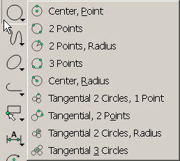
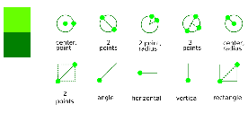
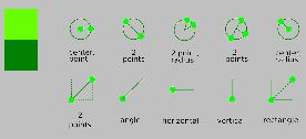
Your icons look great as they are shown here, large and with white background. But you have to consider in reality they are shown much smaller, size differs depending on screen size/resolution and also on the tab, they get blurred, and the background colour mostly will be different. The black rims around coloured elements in the present icons don't give a neat look, but help keeping them readable under these circumstances.
Dashed lines especially tend to look very blurry when rendered small. Also I think elements not saying really something, just added for looking good, should be avoided.
Using a dark variant of the chosen icon colour instead of black I find an interesting approach worth to be explored further. This dampens the harsh contrast but still helps readability.
When former developer ravas made the advanced more configurable user interface, he incorporated a possibility to change the icon colour to your likening. I have never tried to find out how this works and experiment with it. But the use of this feature should be in the mind also.

Icons shown in Win XP on my 1200 x 1920 display

Your icons at a comparable size

Same with grey background
Here the link to the present LibreCAD svg icons. You might use these as a template for your own experiments. The grid size used was according to a proposal by ravas, may be that's not optimal, a graphic's design crack may know better.
https://github.com/LibreCAD/Resources/tree/master/librecad/iconsI hope I'm not discouraging
dellus