Big relief, thank you !
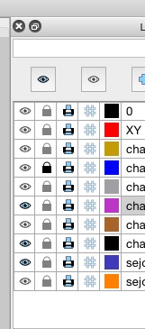
and the framing of the 'eye' and 'lock' icons helps too.
The light blue background of the action icons has my vote.
--jp
Can you better differentiate the active or non active state of a layer,
e.g. a really washed out gray on blind eyes (bigger eyes possible?) and open locks.
