QDockWidget vs QDialog
12
12
|
Is there a significant benefit from the layer list and command line being dockwidgets?
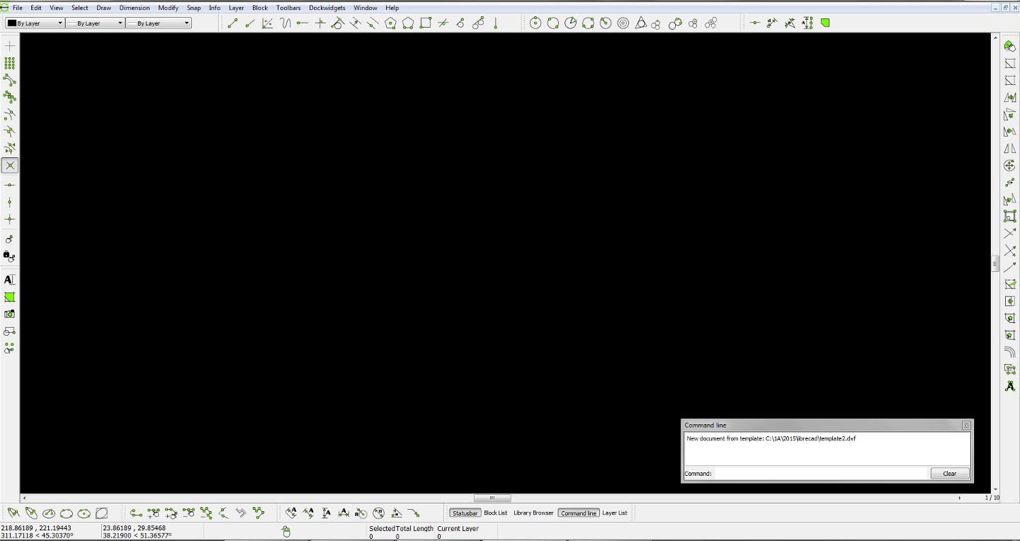
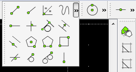
I like using them as floating windows; and I toggle them with my handy new toolbar. ;-] Therefore, the docking is troublesome and I would personally change them to QDialog. A preview of some of the new toolbars: 
|
|
I prefer the old way of dynamic/tree structure:
1, unified place for CAD actions; compared with looking around to find a drawing action tool button; 2, two column structure allows 20 or more actions group; it's nor easy to search in a long vertical toolbar, because human eyes are much better searching horizontal lines; 3, a dialog/pop-up style command line can be a feature, but I suggest a plain layout similar to the current way, to avoid a shock for current users; 4, users often complain about difficulty in finding option dialogs ( as in RS_ActionInterface::showOption() ), we may want to do something to make them more conspicuous.
|
This is the only benefit of the current CAD toolbar, and is completely outweighed by the need to constantly go in and out of sub-toolbars. Individual toolbars can be arranged in many ways! That includes the ability to cram them all into one spot if you want, and expand them when needed:  However, the main point here is that these are just the standard toolbars. My vision is that users can additionally define custom toolbars with only the tools they use. This will dramatically cut down on space requirements and scanning with the eye. The top toolbar bay can be for your most used toolbars, and the bottom for seldom used toolbars, or however you prefer... there are so many options with top, bottom, left and right toolbar bays and the ability to stack toolbars vertically and horizontally. What were you envisioning when you asked me to work on the CAD toolbar? |
|
Hi ravas,
Don't get me wrong. Clearly, you have more experience here than I do, so I am trying to find negative aspect of each. What's in my mind (feel free to correct me): 1, plain look; so, it's light, and doesn't feel like a toy, with a feeling of "green"; 2, upgraded from a look of Qt3 age, be able to take advantage of Q5(I would support dumping of Qt4 support); 3, I prefer an evolutionary approach, but it's also to do dramatic changes now, since we are preparing 2.1 now; About thhe old CAD toolbars, the "Select toolbar" should not belong to the "CAD toolbar" group. Thanks!
|
|
Using normal toolbars also solves the problems:
http://forum.librecad.org/UI-Support-for-high-DPI-monitors-td5711067.html http://forum.librecad.org/Not-working-well-on-Mac-OSX-anymore-tp5711800p5711802.html Because all toolbars are the same I was able to add an option that allows people to choose a custom icon size. It's ready except the custom toolbar aspect. I'm feeling stuck, because I don't want to take the CAD toolbar away from people that like it; and I also don't want to support or work on that toolbar. Having both in the same program would increase the management complexity, as opposed to simplifying it like we talked about. The only solution I see is for me to just keep it as a forked version. I'll switch my focus to the color options for now. http://forum.librecad.org/operating-layer-not-highlighted-td5711765.html |
|
I pushed a commit with minor tweaking of toolbars:
https://github.com/LibreCAD/LibreCAD/commit/5cb5400d439c9c4501b89eb42fc3c1e9ebde4e81 I'm trying to get the cad toolbar size auto, but still couldn't get it work without the line 52 in qg_cadtoolbar.cpp: maybe, you can find a way to use horizontal cad toolbars, with unified location, or keep the current CAD toolbar look, but with HD problem fixed.
|
|
This is a developers blog, so maybe I should not comment here. But as gui things are discussed I would like to put an issue into concern: todays monitors aspect ratios are getting ever more longish (cinemascope, for watching movies), and if you are having ever more horizontal toolbars on the top and the bottom the remaining drawing window is becoming squeezed up rather longish. For the most objects to draw this is not ideal, a lot of panning and zooming around. So I would like to be able to concentrate many toolbars at the sides. Maybe just my opinion, what do others think?
Regards dellus |
|
that's a good point.
Should we adopt a wider CAD ToolBar instead? Ravas already showed one example of that. Maybe, we should move more toolbars to side from the top toolbar area.
|
|
From a user's perspective Dellus's comments make a lot of sense.
Many applications, particularly those that have adopted the Ribbon Interface, squeeze the working area remaining for the actual document into a horizontal slot which can make viewing it seem like peering through a letterbox. A good model to consider is OpenOffice. It uses a sidebar panel that provides frequently used tools, grouped in "decks" which can be switched between via tabs. Adopting such a model would be a natural development of LibreCAD's existing user interface where the Layer List and Block List are by default docked on the right side of the screen like the OpenOffice sidebar panel. Mike |
|
Re my previous post, the following webpage describes the OpenOffice sidebar. It has screenshots and describes some of the thinking behind it https://wiki.openoffice.org/wiki/Sidebar
Mike |
|
In reply to this post by ravas
I don't feel stuck anymore... in short, I would be offering a superior alternative (custom toolbars). I think I'll ask for some opinions in the user section. |
|
In reply to this post by dellus
Toolbars can be dragged and dropped to the top, bottom, left or right. Click on the dotted line at the end of the toolbar. |
|
In reply to this post by Mike Hayes
In my screenshot you will see I have already implemented this feature at the bottom right. We don't have icons for it currently; however, I have used at least 5 programs with this feature, and have mostly found the icons confusing. Using words instead of icons, it is so much easier for me to know what I'm toggling. That said, if someone can create very distinct icons, then we can consider using those. PS. Check out LibreOffice... which supports .docx, and is considered superior to OpenOffice by many people (including me). |
|
In reply to this post by ravas
@ ravas:
I know the toolbars can be dragged, but it does not work satisfyingly. I cannot place two vertical toolbars in parallel beneath the two-columned cad-toolbar to save space and have a neat look. The pen options and the print-preview options do not fit in. To gain more vertical drawing space you have to get rid of o whole horizontal line of tabs. As a work-around I have moved them to the nowhere-land in the upper right side. A little bit off-topic: I have accidentally moved the edit-tab too far right with the grip outside of the monitor area and cannot move it anymore. I can switch it off, but if I switch it on again it is still at the same place. Even a lc reinstallation does not help, there seems to be some kind of settings file somewhere that survives uninstall, but I can't find it. Is there a remedy? What also bothers me a lot is that the commandline tab and the waste so much unused space on the right side. Could they be unified or live side by side to gain vertical space? Perhaps your approach with normal toolbars can tackle all this better. Maybe you really should publish a forked test-release so users can try out. regard dellus 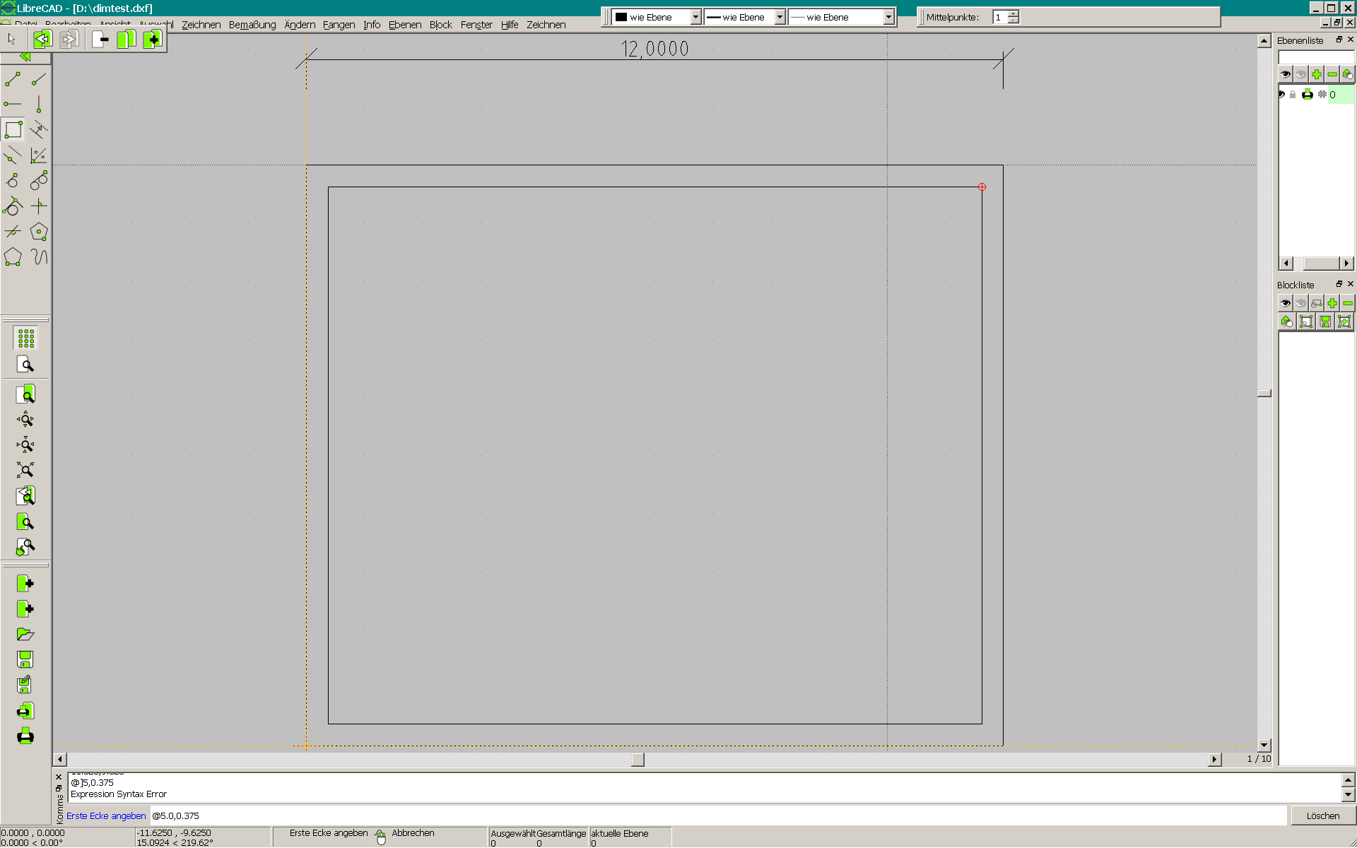
|
Coincidentally, I asked about this on a Qt forum two days ago... No useful replies yet. I'll let you know. I can make an installer for Windows. |
|
In reply to this post by dellus
Also, at the risk of you telling me you already know... ;-]
You can double click on the command line title or click the two little squares above it to make it a floating window. You can also drag it below your block list.  Something I just realized which is definitely a benefit of the QDockWidget, is that if you drop one on top of the other it creates tabs! 
|
|
Now that I'm aware of the automatic tab creation by dockwidgets,
I'm re-imagining my "tooltabs" idea... While not as simplistic to maintain as toolbars, perhaps it would allow for a grid of icons that will change relative to the dimensions of the dockwidget. So many ideas... if only I could clone myself. >_< |
Hey ravas I love your ideas, you are becoming a true visionary for LibreCAD. You seem to really enjoy tweaking the GUI side of things - as such I have a question for you - would it be possible to offer the option in LibreCAD to have the colour scheme to be a slightly darker Green, I like the current bright colour Green, but it would be good to have the option for something different also? BTW, thanks for all of the effort you are putting into LibreCAD. |
|
Thanks :-] It's nice to have my ideas and effort appreciated.
For changing icon image color the only thing I found was http://doc.qt.io/qt-5/qimage.html#pixel-manipulation Another idea would be to write an independent script (using any language) that walks the icon directory and changes the green value of each image. It likely already exists... I'll research it more later. Maybe someone more experienced with image manipulation can help. |
|
In reply to this post by dellus
dellus, I thought of a way to solve your toolbar issue.
- Download Autohotkey http://ahkscript.org/ - install - right click in a folder and choose New → Autohotkey Script - Open the file with a text editor (https://notepad-plus-plus.org/ or http://fincs.ahk4.net/scite4ahk/) - paste in the following: f7:: winmove, a,, 200, 200 return - save (UTF-8) and close - double click the file to launch it - click on the toolbar to make it active - press f7 |
«
Return to LibreCAD-dev
|
1 view|%1 views
| Free forum by Nabble | Edit this page |


